Monday, December 14, 2009

Updated Design (history poster)


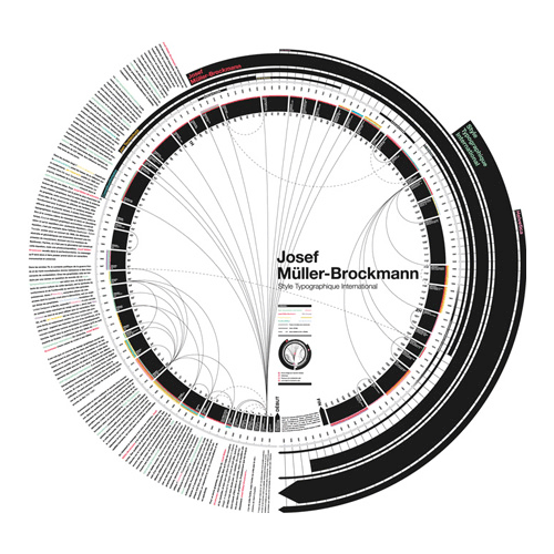
. How does your design teach something about a particular segment of history and engage the audience?
2. How does your design conform to the "rule of thirds"?
3. How have the principles: emphasis, alignment, contrast, balance, flow and repetition
been implemented within your design?
4. What role does color serve within your design?

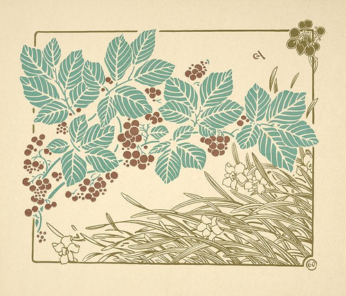
In generalizing karate, the best that i could, i wanted to find the earliest history or orgination of the art. So i presented my audience with specific knowledge on the first man to travel and use a given "self-defense" as protection that later transformed into what we know as karate. The design in general portrays the rule of thirds in that the headline or banner KARATE across the top with the SUN is first third, the area with the man kicking is the 2nd section of thirds which contains the font also. Then the last rule of thirds completed by the man in the low stance doing his form. All of these are directly inspired to make my audience travel around the design in a successful mannor. The REPETITION of the suns rays lead from all ends of the spectrum of this design. I Made sure the colors were opposite as in yeellow and grey to create CONTRAST amongst the design and to help BALANCE the various colors. As far as the way my design FLOWS, its relativity and connection is seen from the KARATE headline which leads into the man kicking while bringing the viewers eyes down into the middle third which contains the information as well as the bottom third where the second picture lays back. After the information is read and history is presented, the rays all draw the eye back up to the vibrant sun and it starts over again in a consistent flow. I would say that color is the biggest significance to this design followed by the figures. Without creating a focal point of the sun and the vibrancy of the rays, the flow and balance wouldnt be completed. It really makes the sun pop out and immediately allows us to follow the rays out to deliver the information to my audience.

Monday, December 7, 2009

Monday, November 16, 2009

Design Styles

Post Modernism Design:

When we key into POST anything it is following a certain time frame. But in particular we key into the passing of anything "modern" or ordinary. It is largely influenced by the western european disillusionment caused from WW2. It is anything BUT the ordinary in that it presents extreme complexity, unorganizability, contradictory, and diversity.


Modernism Design:

Modernism design is simply that.. it is a "modern" or basic thought processes. It came from the School of New York in the late 1950s and was directly influenced from abstract expressionism and pop art. Artists of all sorts gathered and became part of this movement that was known as the "modern movement" presenting their work and ideas. Modernism characterized by Form and use of negative space and specific organization which was based upon a sense of self-consciousness.


Swiss Design 1950-1970:

When identifying swiss school design you would note heavily the composition, typography, and sort of communication. Using images, color and form, the viewer is lead to perceive a given design by analyzing its structure. The swiss collection is one of many presented at the Carnagie mellon university libraries and is still viewed and admired by many around the world today.


International Typograhpical style :
Represented and orignated from Switzerland from 1950s as well but presents a style or sense of cleanliness, objectivity, and readibility. Although typography is one of the main elements in its structure..some of the style may incorporate drawings, illustrations and photographs to graps their viewers eye.


Art Deco Design :

This movement took place in the late 1920s(1925 to be exact) to 1940s and affected arcitecture, fashion, interior designing. Arts of this design were very elegant and functional. They also incorporated any history of art such as cubism, art nouveau or constructivism in it. Its rich design and composure is seen in the paramount theater in oakland or the notorious Golden Gate bridge in CA.


Constructivism:

It originated in russia from 1913 and onwards but rejects the idea of "art for arts sake" ..It is taking from new experiences and thought processes to developing new knowledge based from thier intake of assimilation and without taking the orignial framework out of context or its orignial construct.


Bahaus Design:

Originated from Walter Gropius' school in Weimar. He was an architect who generated his designs in typography, interior design, graphic design and industrial design.


ARt Nouveau Design:

It mainly started as a inspiration or response to academic art of the 19th century, it is characterized by organic, especially floral and other plant-inspired motifs, as well as highly-stylized, flowing curvilinear forms. ARt nouveau is used in things such as furniture, architecture and making everyday life objects involved through use of it's style.


Monday, November 2, 2009


Through the design that I have created i was able to reflect the mission of BCC and engage my audience in a few ways. Instead of showing pictures of just the campus I decided to incorporate more of BROOME county itself. The picture of the balloon signifies our notorious balloon and speedie rally that binghamton is known for every year. I have also tied in some rolling mountains to show the beautiful scenary that upstate New York provides through the changing seasons. At the bottom of the page I have connected the smiling student life that ensures a sense of satisfication and intrest within our college.
Using the rule of thirds were implemented in a few ways. One way is the way i seperated my foreground, middleground, background. I have my smiling student life up front which leads into my middle ground where the train flows off the page but trails back with a principle of repetition through the train carts. It then leads the audience into my rolling mountains and sky which contains my hot air balloon. And in return, the balloon happens to be my one main focal point of the design. You are lead instantly by the bright red color which sends the viewers eye through the mountains and down into the valley where the train and student life are. Another creative focal point i have implemented would be through Brittany's smiling face, or if you take a closer look, the thumbs up which she is giving a sense of flow and direction leading my audience up the side of my cover where the information about the catalog is given. The principle of alignment that is provided also helps lead the eye to the upper third of the design. I have adequately provided a foreground, middle-ground and background which provide a principle of balance in my design and give the viewer an entire scene or setting to look at.
I would have to say the color red of the balloon and the vibrant faces in the bottom are the main entities that i made really pop in perspective but i decided to use gold for the alignment of the information on the side of the catalog and black at the top. In particular because they are our schools colors which most prominantly represent our college. Or as the motto goes YOUR college. The other colors are nature in itself, i did not render them any different just to preserve the natural beauty of scenic upstate New York.

Saturday, September 26, 2009

B/W typographical


ROUGHSSS


Through study and experiment using letters forms and counter forms I acquired my design/image. A few things I obviously kept in mind were emphasis, balance and flow, followed by repetition, contrast, and alignment. Using the dark contrast of my upsides down j it has major emphasis to draw the eye specifically up to the left corner. With the cut sphere(came from the top of j) transcending off the end and heavy contrast with the counter j form behind it; it draws eyes to the right side. From following the segmented dot it then creates a sense of flow leading my viewers and audience into the upside down F's. I used Sans Serif f in the background to give more depth. The Dot in the counter form of the grey-scaled J then helps further balance the left side with the right side of contrasted F's. Using alignment through contrast it draws the viewers attention on the right. The several F's brings a sense of repetition and depth. I added the Brushscripted N to create unity and balance the entire design with the initials of my name JFN. I implimented the rule of thirds as well by acquiring a focal point with the upside down j and the F's which cross vital areas on the grid. I think my design is very effective in that ive used all of the design principles and acquired a firm understanding of forms and counterforms.

Monday, September 21, 2009