Post Modernism Design:
When we key into POST anything it is following a certain time frame. But in particular we key into the passing of anything "modern" or ordinary. It is largely influenced by the western european disillusionment caused from WW2. It is anything BUT the ordinary in that it presents extreme complexity, unorganizability, contradictory, and diversity.


Modernism Design:
Modernism design is simply that.. it is a "modern" or basic thought processes. It came from the School of New York in the late 1950s and was directly influenced from abstract expressionism and pop art. Artists of all sorts gathered and became part of this movement that was known as the "modern movement" presenting their work and ideas. Modernism characterized by Form and use of negative space and specific organization which was based upon a sense of self-consciousness.


Swiss Design 1950-1970:
When identifying swiss school design you would note heavily the composition, typography, and sort of communication. Using images, color and form, the viewer is lead to perceive a given design by analyzing its structure. The swiss collection is one of many presented at the Carnagie mellon university libraries and is still viewed and admired by many around the world today.


International Typograhpical style :
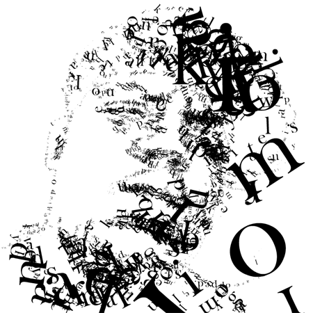
Represented and orignated from Switzerland from 1950s as well but presents a style or sense of cleanliness, objectivity, and readibility. Although typography is one of the main elements in its structure..some of the style may incorporate drawings, illustrations and photographs to graps their viewers eye.


Art Deco Design :
This movement took place in the late 1920s(1925 to be exact) to 1940s and affected arcitecture, fashion, interior designing. Arts of this design were very elegant and functional. They also incorporated any history of art such as cubism, art nouveau or constructivism in it. Its rich design and composure is seen in the paramount theater in oakland or the notorious Golden Gate bridge in CA.


Constructivism:
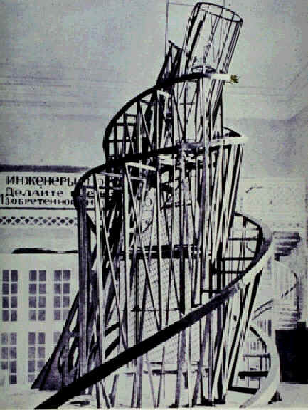
It originated in russia from 1913 and onwards but rejects the idea of "art for arts sake" ..It is taking from new experiences and thought processes to developing new knowledge based from thier intake of assimilation and without taking the orignial framework out of context or its orignial construct.


Bahaus Design:
Originated from Walter Gropius' school in Weimar. He was an architect who generated his designs in typography, interior design, graphic design and industrial design.


ARt Nouveau Design:
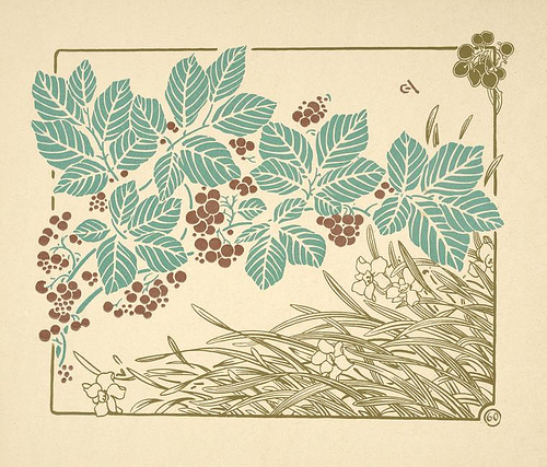
It mainly started as a inspiration or response to academic art of the 19th century, it is characterized by organic, especially floral and other plant-inspired motifs, as well as highly-stylized, flowing curvilinear forms. ARt nouveau is used in things such as furniture, architecture and making everyday life objects involved through use of it's style.


